REPORTDASH
Transforming Marketing Data Into Visual Clarity
Project Concept Label
UI/UX Design, Web Design, Competitive Analysis, Visual System Design
Project Type

INTRODUCTION
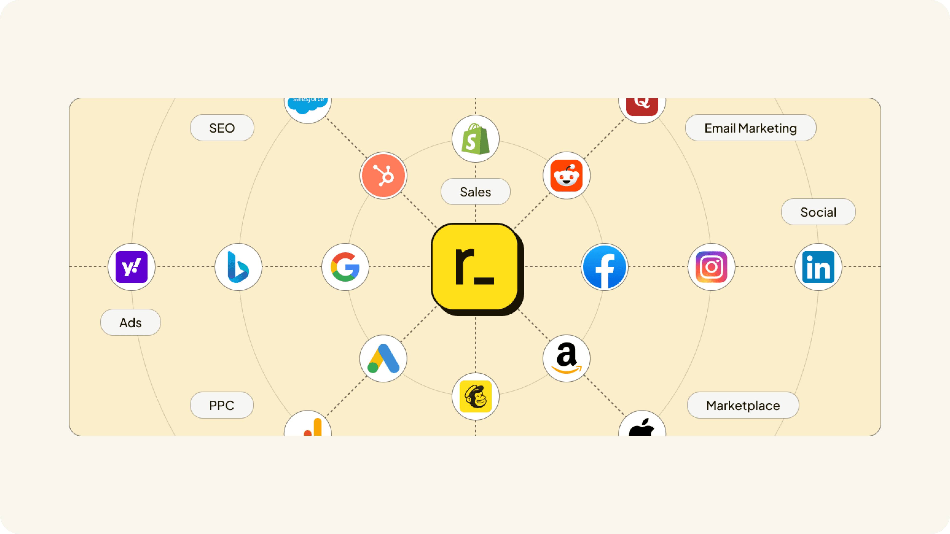
MY ROLE Lead Designer | Complete Website Design (15+ Pages), Unique Visual System, Competitive Strategy Reportdash is a marketing data platform that unifies cross-channel reporting for agencies, marketers, and enterprises. Built by marketers who spent a decade solving reporting problems, the platform connects to 14+ marketing sources like Google Ads, Facebook, Shopify, and Analytics, transforming fragmented data into unified, queryable insights without requiring SQL knowledge. THE CHALLENGE As the lead designer, I faced the challenge of positioning Reportdash in an incredibly saturated market. Marketing analytics platforms are everywhere, from industry giants like Google Analytics and Tableau to specialized tools like Supermetrics and Funnel.io. Every competitor claimed to be "simple," "unified," and "no-code." Breaking through this noise required more than just good design. It demanded strategic differentiation that was immediately visible and viscerally felt. The website needed to accomplish multiple goals at once: communicate complex technical capabilities to marketing teams, establish credibility with enterprise decision-makers, showcase the platform's unique "DataStore" architecture, and make data engineering feel accessible to non-technical users. All while standing out in a category where every website looks virtually identical.
DESIGNING METHOD
EXTENSIVE COMPETITIVE ANALYSIS I began with extensive competitive analysis, studying dozens of marketing analytics platforms, data warehouse solutions, and BI tools. I analyzed their messaging, visual approaches, information architecture, and user flows. A clear pattern emerged: competitors defaulted to generic SaaS aesthetics with blue gradients, abstract dashboards, stock charts, and safe corporate design language. Everyone looked the same because everyone was playing it safe. STRATEGIC OPPORTUNITY IDENTIFIED This research revealed my strategic opportunity. While competitors focused on showcasing features through literal product screenshots and abstract data visualizations, there was space to communicate value through distinctive, conceptual visual storytelling. Instead of showing what the platform looks like, I could show what the platform does: transforming chaos into clarity, fragmentation into unity, complexity into simplicity. COMPREHENSIVE INFORMATION ARCHITECTURE Armed with these insights, I developed a comprehensive information architecture for the entire website, designing over 15+ pages including the homepage, platform pages, sources, destinations, templates, pricing, company, and various landing pages. Each page was strategically structured to guide different user personas, from agency owners evaluating client reporting solutions to enterprise marketers assessing scalability. UNIQUE ILLUSTRATIVE VISUAL STYLE My visual design approach became the project's defining feature: creating a unique, illustrative visual style that differentiated Reportdash from every competitor. Rather than relying on product screenshots or generic stock imagery, I developed custom illustrations and graphics that conceptualized marketing data challenges and solutions. These visuals used clean lines, vibrant accent colors against professional backgrounds, and abstract representations of data flow, making technical concepts feel intuitive and approachable.
PURPOSE-BUILT ILLUSTRATIONS Each illustration I created was purpose-built to tell a specific story: data sources converging into unified views, complex transformations happening automatically, cross-platform insights emerging effortlessly. My visual language balanced professionalism with playfulness. Sophisticated enough for enterprise buyers, approachable enough for small marketing teams just getting started. TYPOGRAPHY & LAYOUT STRATEGY My typography and layout choices reinforced clarity. Generous whitespace prevented information overload despite dense technical content. Clear hierarchies guided users through complex feature sets. Modular components created visual consistency across all 15+ pages while allowing flexibility for different content types. STRATEGIC COLOR SYSTEM The color system I developed was deliberately restrained. Professional blues and grays formed the foundation, with strategic pops of vibrant accent colors to highlight key features and guide attention. This approach felt contemporary and confident without falling into the oversaturated gradients plaguing most SaaS websites. CONCEPTUAL DESIGN PHILOSOPHY Icon systems, data visualization mockups, and UI component designs were all created with the same philosophy: show value through conceptual clarity rather than literal screenshots. This approach future-proofed the design. As platform features evolved, the visual system could communicate new capabilities without complete redesigns.

FINAL PERFORMANCE
IMMEDIATE MARKET DIFFERENTIATION The redesigned website successfully differentiated Reportdash in the crowded marketing analytics market. My unique illustrative visual style became an immediate differentiator. Visitors could recognize Reportdash visuals at a glance, creating distinctive brand recall in a category plagued by visual homogeneity. RESEARCH-INFORMED STRATEGY My comprehensive competitive analysis directly informed every design decision, ensuring the website didn't just look different but strategically positioned Reportdash's unique value propositions. Where competitors emphasized complexity and feature depth, Reportdash emphasized simplicity and automation. Where others showed dashboards, Reportdash showed outcomes. COHESIVE ECOSYSTEM The 15+ page website I designed created a cohesive ecosystem that supported the entire customer journey, from initial awareness through feature evaluation to pricing consideration and final conversion. Each page felt connected yet purpose-built for its specific role in the funnel. ACCESSIBLE COMPLEXITY The illustrative visual approach I developed solved multiple challenges at once. It made complex data engineering concepts accessible to non-technical marketers. It positioned Reportdash as innovative and forward-thinking rather than corporate and generic. It created emotional resonance because users could see themselves in the visualizations of marketing data chaos transforming into clarity. INSTANT VALUE COMMUNICATION Most importantly, the design communicated Reportdash's core promise instantly: "Clean, unified marketing data." The visual clarity of the website mirrored the product's value proposition. What you see is what you get. No confusion, no complexity, no friction. STRATEGIC POSITIONING SUCCESS The competitive differentiation extended beyond aesthetics. By studying what competitors emphasized versus what users actually needed, my information architecture prioritized different features, highlighting "always-on data," "zero maintenance," and "cross-platform views" over technical jargon that only engineers appreciated. This strategic positioning, reinforced through distinctive visuals, positioned Reportdash as the marketer-friendly alternative in a field dominated by engineering-first tools. The result is a website that doesn't just inform, it convinces. It demonstrates that Reportdash understands marketers' frustrations and has built a fundamentally different solution. The design itself becomes proof of the platform's promise: transforming complexity into clarity.